


The first picture depicts the loose pencils to lay out everything. I say "pencils" but all of the artwork was completed digitally. I like using blue for pencils and then bringing down the opacity before inking. For those not knowing what that is, opacity is how dark the lines are. I lower the opacity before I go over in black so it isn't as distracting.
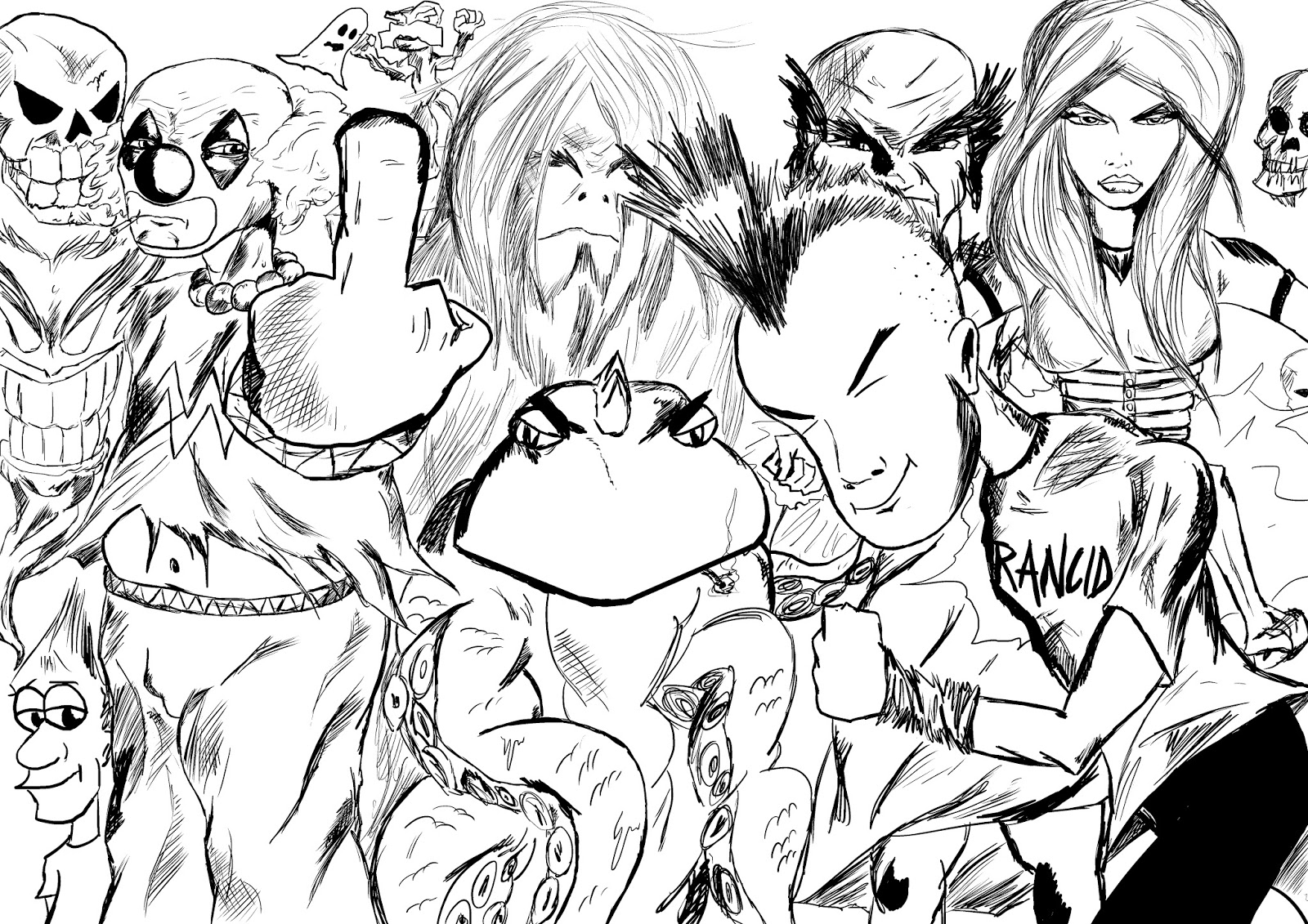
Here is the black and white version before adding the lettering. I teased this on Instagram and my personal Facebook page. The overall reaction was pretty positive.

I played with coloring the logo but ultimately decided to go black and white. I thought colors that overlapped and went outside the designated lines might be a cool look but in the end felt it was distracting from the words "Drawn Out."

As stated earlier this logo was made digitally. It was drawn using a Wacom Intuos Tablet using the program, Manga Studio 5. The lettering for the logo was made using Comic Life 2.
Do you have a favorite logo? Maybe you want more information on some of the characters in the blog(Blasto the Clown has his own Twitter account). Is there anything you'd like to on the "Drawn Out" blog? Leave us a comment and let your voice be heard.
Please show support for this blog by checking out our sponsors. We have just added Movie Pass as one of our supporters and they have one of the coolest services ever for those of you who enjoy going to the movies. Go to as many movies as you would like for $30 per month!
No comments:
Post a Comment